Return here to The Opposite of a Moth home page.....

Thursday, December 31, 2009

The Grail, or Something Like It

In his book about the *Grail, John Matthews makes the point that the quest for the Grail is never truly over. I would add that the reason for this is not so much that the Grail will never be found, but that what the Grail actually is, and what it represents, is different for those who quest after it. Sometimes we find what we are looking for, and sometimes we don't. And sometimes what we find is not that which we originally had sought.

Whatever it is that you seek, I hope that you may find it - or something very like it - in the year to come. And even if you do not do so, then I hope that your journey is still an interesting one.

A prosperous and rewarding 2010 to my followers, to my readers, and to all fellow bloggers!


Artist: Hawkwood
Work: The Quest, 1989 (digital version: December, 2009)
Medium: Acrylic, with digital elements
Location: Private collection


Source: *The Grail: Quest for the Eternal, by John Matthews. Thames and Hudson, 1981

Thursday, December 24, 2009

A Winter Silence

Exactly one hundred years ago the Dutch biscuit company Verkade released with their products a series of collectors' cards. The cards were from paintings commissioned from the artists Jan van Oort and Jan Voerman, and it became an engaging passtime for many households at that time to paste the cards into the albums, descriptively written in period Dutch by Jac P. Thijsse, which Verkade issued for the purpose.

Many of the albums were themed around the nature and wildlife of The Netherlands, and the paintings, and the albums with their cards, passed into Dutch folk art and became collectors' items - so much so that various facsimile editions were subsequently issued. The most recent reissue depicting the four seasons (which are the four albums which I have) even included a set of cards to cut out and paste á la the style of the originals.

Well, I have to admit that, several years later, I still haven't gotten around to pasting in the cards (give me a break; there are one hundred and forty four in each complete set). Maybe it's something to do with the times. Not that I'm impatient, because I can cheerfully muster the wherewithall to labor for hours customising HTML codes. But there might be another reason.

Because truth to tell, it is not so much the more well-known paintings on the cards that have my attention, as it is the pen drawings which decorate the albums. So I guess that (perhaps rather ungraciously in the eyes of Dutch folk culture!) the cards are for me rather redundant, as I apparently find that the albums with their black-and-white illustrations are already satisfying-enough in themselves. A modest credit on the albums' title pages mentions that these are by 'L.W.R. Wenckebach'.

Wenckebach's illustrations hold up throughout the series, but it is those which appear in the Winter album that truly shine (the six images shown here). With remarkable economy of line, snow-covered fields, canals and Dutch farm houses are conjoured from Wenckebach's pen lines, their darkness made more stark by the areas of paper which have simply been left blank to convey the covering blanket of whiteness.

Pollarded willows so typical of the Dutch landscape bend over a frozen canal. A woman carrying pails (presumably of animal feed) makes her way over the snow to a farm house door. Boats frozen fast into the ice lie immobile by a snowy bank. On the edge of a village a bridge spans the snow-covered ice of a river. The atmosphere of crisp winter silence is tangible.

As it happens, outside my window the snow does indeed lie thick on the ground at the moment, and despite a couple of attempts at a thaw, remains much as it fell several days ago. A perfect opportunity for contemplating these superb line drawings by L.W.R. Wenckebach, and for bringing them to an audience as international as they deserve.


Artist: Ludwig Willem Reymert Wenckebach
Works: Illustrations for the album 'Winter', 1909
Medium: Pen and ink
Location: Untraced

Source:
'Winter', by Jac P. Thijsse, published originally by Bakkerij 'De Ruijter', Firma Verkade & Co., 1909. Facsimile edition issued in 1997.

Thursday, December 10, 2009

The Sheltering Snow

At the beginning of the fourth century, in the city of Mérida, a young Spanish girl was martyred. During these early centuries of the new Christian faith, and the perceived threat which it presented to Imperial Rome and the established order, instances of - and opportunities for - dying for that faith were frequent enough. What perhaps is remarkable in the case of Eulalia is that, even at such a tender age (she was no more than twelve or fourteen at the time) she appararently actively sought her own martyrdom.


Knowing her daughter's declared willingness to make this supreme sacrifice, her mother attempted to hold Eulalia within the confines of her home. But her daughter escaped, found her way to the occupying Roman magistrate, and announced that she refused to sacrifice to the Roman deities. The instruments of torture were laid before her, and it was explained to her that all that she needed to do to avoid their use was to make a simple offering of a little salt and incense, which were then provided for her for that purpose. Eulalia remained resolute. The inevitable sentence was summarily executed. She was stripped. Her flesh was torn from her body with iron hooks, exposing bone. She was then staked, and burning torches were passed over her ragged flesh. Death finally came through suffocation from the inhaled smoke.

Legend steps in to elaborate upon history. At the moment of her death, a white dove appeared to issue from her mouth and ascend to heaven. When her mutilated body was cut down and laid upon the ground, a deep snow suddenly fell to clothe the broken and naked young corpse with a covering shroud of purest white. Redemption can take many forms. For Eulalia, it came in the form of the gently-falling snow so unexpected that the hardened soldiery, standing in the flakes of drifting white, were stunned to awed silence. Future canonization duly followed.


This is the story which the painting by Victorian artist John William Waterhouse (above) purports to portray. But if legend can elaborate upon history, then art, apparently, can elaborate upon both. The version of events as portrayed by Waterhouse would seem both accomplished and disturbing. Accomplished, because the artist has opted for a composition as dramatic as it is difficult to bring off, with its acute foreshortening of the principal figure of Eulalia, and its restrained and atmospheric palette of muted earth reds and cold grays. Of course Waterhouse was both an accomplished draughtsman and storyteller - as his hugely-popular Lady of Shalott, painted three years after his St Eulalia, testifies. But his treatment of Eulalia's martyrdom contains disquieting undercurrents.


The artist's model who posed for the young saint was clearly no girl at the threshold of her teen years, but a mature young woman (the inverted detail, above). And the powdery layer of snow - surely one of the central elements of the story - does anything but discreetly cover the lifeless half-nude body. Not even the most inoffensive suggestion of mortified flesh is apparent. Instead, the artist has opted for a symbolic flowering of spreading hair; an element that was already being considered in his preparatory sketch (below). That Eulalia had lustrous long tresses is known. But what is also known is that these were burned away by the torches. In these details - or rather, in the lack of them - Waterhouse presents us with a version of history which strays beyond being merely idealized to being actually sanitized. But for whose protection? For the artist's? For the sensibilities of his viewing public?


History already offered the artist the solution to this visual dilemma: the grievously mangled body of Eulalia was covered by the sheltering snow. And not the light dusting which Waterhouse shows, but a drift deep enough to make the body discernible only by its general outline. But it would seem that in his choice of a mature model, and in leaving that model unblemished and literally exposed, Waterhouse succumbed to the temptation to portray a whiff of mild Victorian *eroticism whose dubious inclusion was a betrayal of the very subject which he had chosen to portray.


Waterhouse was a master of such subtly suggestive treatments, and the studied slipped-off-the-shoulder costumes of such subjects as Psyche (the detail, above) must have had the thoughts of his Victorian audience racing with adventurous possibilities. But when he came to paint such a sensitive subject as Eulalia's martyrdom, was there not some small voice which said to him that such a voyeuristic treatment, however mild, was not merely inappropriate, but a really bad idea? Apparently not.

And the historical Eulalia? The passionate and intense sincerity of the young can burn more fiercely even than that of maturity. But is this enough to explain the young girl's fervor for, and active seeking out of, such a gruesome and horrifying death? And the Roman authorities and those who carried out their directives? Clearly such monstrous inhumanity is inexcusible in the name of any faith. But history sometimes becomes a mirror, inverting previous events. Almost exactly a century later, the horror which Eulalia suffered was again exemplified by the bestially cruel death - in a church at the hands of Christian monks - of Hypatia of Alexandria, one of the most enlightened and progressive pagan minds of her age. Eulalia had hardly begun her teen years when she died. Hypatia was forty five. Perhaps such terrible acts owe less to any perceived threats to a faith than they do to a dark and frenzied *misogyny.

Today, December 10, is Saint Eulalia's day.


Artist: John William Waterhouse
Work: Saint Eulalia, 1885
Medium: Oils
Location: The Tate Gallery, London

Artist: John William Waterhouse
Work: Study for Saint Eulalia c1885
Medium: Pen and ink with grey and brown wash heightened with white on paper
Location: The Tate Gallery, London

*This theme is also discussed in my post of November 2: 'Five Women and Four Serpents'.
*A hatred and loathing of women.

Tuesday, December 1, 2009

The Phantom of the Opera

This is the story of one of my pieces of cover art, and how it came into being. It is August, 1993. I receive a phone call from the art director at Puffin Books, who explains that Puffin are planning a major re-issue of their series of literary classics, and would I be interested in producing the cover art for Gaston Leroux's The Phantom of the Opera (*below) for them? Within a few days I receive contracts to paint the Phantom and *three other Gothic classics for Puffin: Bram Stoker's Dracula, Mary Shelley's Frankenstein and Edgar Allan Poe's Tales of Mystery and Terror, together with some color mock-ups from the art department of the cover designs for the new Puffin Classics series as a whole, which indicate where the title panel will be placed.

These Gothic titles are now out of copyright, which means that there are plenty of editions issued by other publishers to vie for attention in the bookshops with what Puffin will be offering. For me this is an agreeable situation, because if there are half a dozen different editions of the same book from which a potential purchaser can choose, then generally it's all down to the cover to help sway the choice that is made. At this stage I myself have no clear idea of how I am going to approach the illustration for the Phantom, other than to be guided by Puffin's request that I feature the respective 'monster' of each Gothic on the cover.

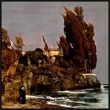
I sift for some vision of how the Phantom – Erik in Leroux’s story – might look. The American edition which I have to hand shows only the eerily-deserted grand staircase of the Paris Opera House on the cover. It's a professionally accomplished illustration, but there's not a phantom in sight - imagined or otherwise. And the films? The 1925 silent version with Lon Chaney, Snr., once seen, remains indelibly in the mind, resonating with the authentic power of a dream, or of a nightmare. Subsequent versions tend to offer a suave and rather romantic Erik who remains discreetly masked. I make a decision to ignore all previous interpretations and go back to Leroux's original text.

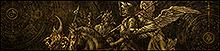
The airy baroque interiors of the Paris Opera House are transformed under Leroux's pen into spaces which become dark, brooding, and strangely claustrophobic in their vastness (above, and below). Leroux's opera house is at the same time both the same as, yet different from, the opera house of reality. It is a world closed in upon itself, and it is only in the air of this other opera house that Erik can breathe and live out the events of his tragic life. When one begins to read the book, one begins to breathe the same air as Erik, and his presence - even on the many pages in which he does not directly appear - is tangible. I scan the pages for a description of Erik's appearance: the cadaverous face, the yellowed skin stretched taught over the bone, the lack of a nose, the inexplicable glowing lights in the dark recesses of the eyes. As with a reading of Frankenstein, one becomes so familiar with the subsequent interpretations of others that the author's own description of the character comes almost as a shock.

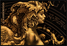
I make some tentative sketches in pencil. The face described by Leroux seems so genuinely appalling that I find myself drifting towards a masked portrayal after all. I look through some pictures of stylish Venetian carnival masks. But Erik's mask is of black cloth. Not much help. Perhaps I can solve the problem by showing Erik unmasked, but keeping him as a dark figure in a corridor of shadows. I make another sketch. The result looks melodramatic - the very thing I'm trying to avoid. I decide to abandon the idea of attempting to show any atmospheric background, and zoom in on the face alone until it fills the entire cover area (my pencil sketch, below). It's only a rough sketch, but immediately I have the feeling that Erik is staring back at me. I work some more detail into the sketch and fax a copy to the art director. He offers enthusiastic encouragement for the idea.

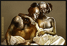
Now begins the tracking down of reference material that might help me with the actual painting. Pictures of the Egyptian mummies in the Leiden Museum of Antiquities, and a photo of the naturally-mummified body of a priest in the Colombian Gold Museum, all become grist to the creative mill. I coat the face of my obliging son with a flour-and-water paste, then crackle-dry the resulting goo with my wife's hair dryer, studying the effect. On a canvas board I have previously applied a coating of ivory-colored oil paint with a palette knife. This ensures that the texture of the canvas will not appear too pronounced in the final reproduction, and provides me with a suitable ground on which to begin the painting. The board is about three times larger than the printed cover will be, as I know from experience that my work tends to look best in print when reduced by this ratio. But this will make the face which I am about to paint considerably larger than life-size, and my planned in-your-face approach to the Phantom becomes a shade more daunting.

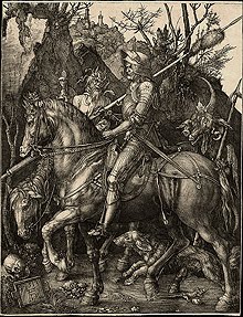
I begin painting the main areas of tone with a monochromatic earth-brown oil color, and progress to the point where I must break in order to allow this first stage to dry. I prop the board against a chair in a corner of my studio. At this stage it resembles an old daguerreotype, and l'm tempted to leave the final painting with something of this look to it. As a rule, my cover paintings tend to be strongly color-themed, as this greatly enhances the impact of the printed image when it appears in the bookshop, and this seems to hold particularly true for the Gothics. There is a good reason why the original silent film version (above) of Leroux's tale packs a greater punch than any later Technicolor version. I'm now left with time on my hands as I wait for this first stage to dry. On an impulse, and to make economic use of my own time, I begin painting *Frankenstein (below). From where I'm sitting I can see the first painting, and as Mary Shelley's tragic creature takes shape in front of me, Erik continues to watch me from the corner.

And so it continues, as these two feared and tragic beings gradually assume their finished form. The atmosphere in my work area becomes noticeably more oppressive. I begin to suffer from headaches, and my wife complains - with justification - of my own increasingly morose behavior. My studio becomes a no-go area for my impressionable seven year-old daughter, and I myself start to question my own wisdom in involving myself so closely with such material. Normally I prefer not to paint at night, as artificial light distorts the accuracy of colors. But now I find myself drawn to my studio over several successive evenings, working by the hard-edged light of a halogen lamp, manipulating the brush to create the blotched and mottled texture of Erik's skin. I actually enjoy the surrounding shadows. In the yellow-white halogen light I experimentally exhale smoke from my pipe onto the painting, wreathing the Phantom in a drifting cloud. The effect is wonderful, and I try to translate it into paint, making the shadow areas which surround the face less dense, until the darkest areas of the painting are the eyes themselves: twin ovals of unknowable space, in each of which a distant sun is burning, exactly as described by Leroux. The last touch is to surround these two suns with a red coronal glow, and the painting is complete.

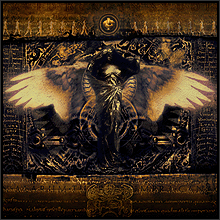
Fifteen years later I returned to the painting to rework it digitally (above) for a more current portfolio of my work, adding some faded blooms and a page from the score of La Traviata. Perhaps it is an unexpected point to make, but during the creation of the original painting, as with the other Gothics, I did not intentionally set out to try and be scary. Rather, I attempted to approach these images as straight portraits, striving to keep the expressions relatively neutral. I think that readers always feel when someone is actually trying to make them scared, and the natural reaction to this tends to lead to the opposite effect. Those who have seen my 'portrait' of Erik tend to comment on a certain inexplicable gentleness in the face. It is this sensitivity of spirit, trapped as it was within a nature coupled with explosions of cruel frenzy and the despair of unappeasable loneliness, which to me represents the true horror of the Phantom.


Artist: Hawkwood
Work: The Phantom of the Opera, 1993
Medium: Oils
Location: Collection of the artist

Artist: Hawkwood
Work: Frankenstein, 1993
Medium: Oils
Location: Collection of the artist

Artist: Hawkwood
Work: The Phantom of the Opera, 2008
Medium: Scanned painted, photographic and textual elements
Location: Cyberspace

Sources:
'The Phantom of the Opera', by Gaston Leroux. Puffin Classics edition, 1994
'Frankenstein', by Mary Shelley. Puffin Classics edition, 1994

This post has been partially rewritten from my article which originally appeared in the Spring, 1995 edition of the Phantom fanzine BENEATH THE MASK. My appreciative thanks go to the founder of the British-based Phantom Appreciation Society for contacting me via the publisher to communicate her glowing response to my cover art on behalf of the Society. "All of us.."(her letter to me ended) "..have our own visions of how Erik must have looked - you have captured that vision for us." Feedback from the reading public is one thing, but to have received this reaction from such a critical audience is praise much-valued!

*My cover for this edition of the Phantom is generally available to see on the Internet, although these other versions - and the printed cover itself - tend to give my original colors a strong orange cast. For my image for this post, I have matched the colors to my original painting.

*I subsequently received commissions to produce cover art for three further Gothic titles: Victor Hugo's The Hunchback of Notre-Dame, Robert Louis Stevenson's Dr Jekyll and Mr Hyde, and Coleridge's The Rime of the Ancient Mariner. But by this time, further editorial hands were involved, and it is the Phantom, and the covers for Mary Shelley's Frankenstein and Edgar Allan Poe's Tales, which remain my own favorites, being the three titles to reach the bookshops virtually intact from my original planned sketches.

*See my post of September 13: ‘Monsters Have Light Inside’.

Friday, November 27, 2009

The Lair of the Sea Serpent

Obliging monsters have always rushed in to fill the gaps in human knowledge. When far lands were still unexplored, and the vast stretches of ocean which divided them were still uncrossed, our imagination peopled those unknown lands with improbable giants whose heads in the tropic sun steamed like puddings, and the untraversed seas were stocked with huge coiling serpents that would rise up from the deeps to seize terrified sailors from the decks and gollop them down whole - and presumably still alive to regret the experience all the more.

We have inherited the depiction of such scenes from previous centuries, and they invariably brim with action and lurid detail. All the more startling, then, to encounter such a monster as portrayed by 19th century artist Elihu Vedder (above). What makes Vedder's sea monster so effective is its sheer matter-of-factness. Not only does the scene offer no trace of stirring action; Vedder actually depicts the glistening serpent calmly at rest, sunning itself unconcernedly among the dunes by the shore. In the distance a sandy peninsular stretches into a calm blue sea, and the sky speaks only of fine, warm weather. Every element in the painting is the antithesis of the way in which such fantasies have traditionally been portrayed, as in the engraving (below) from Konrad Gesner's extensive 16th century catalogue, which cheerfully included such fantastic creatures alongside more commonly-known animals.

It is a further irony that Vedder painted his basking sea serpent in an age when global exploration and enlightened knowledge of the intervening centuries had confined such threatening creatures to the human imagination. Ironic, because even though we know (as Vedder's audience also knew) that such an animal is the product of fantasy, we find ourselves willingly convinced by the existence of Vedder's monster. In contrast, Gesner's writhing horror, if it touches us at all, might raise no more than an amused smile.

Vedder's first painting shown here was in fact a second version painted some thirty five years after his more finished first version (above). It is always interesting to see the ways in which an artist has chosen to alter things between different versions of the same subject, and the first version is notable for its daring composition. Here, the artist has chosen to break a compositional rule and has used the horizon to split the canvas into two equal halves. And not only that, but the top half is just unbroken empty sky. The effect achieved is of great space and distance. Even the clouds lying on the horizon are less defined than in the later version, and we feel that this huge panorama of empty sky, azure sea, and sandy dunes is indeed the realm of the oh-so-believable monster lying before us.

The monster seems peaceful enough. But would we dare to venture past it and take the path between the dunes that leads down to the shore? We are, after all, in an alien realm. It is the realm, not only of the creature itself, but of the artist's own vivid and extraordinary imagination.


Artist: Elihu Vedder
Work: The Lair of the Sea Serpent, 1899
Medium: Oils
Location: The Metropolitan Museum of Art, New York

Artist; Elihu Vedder
Work: The Lair of the Sea Serpent, 1864
Medium: Oils
Location: The Museum of Fine Arts, Boston

Wednesday, November 18, 2009

A Winter Shadow

Here in northern Europe the long winter evenings are drawing in, and today's strong winds are stripping the few remaining dead leaves from the trees. There they lie beyond counting on the damp ground, then briefly sail up again like a club of kite surfers as the wind catches them. And apart from the fact that this year it is unseasonally mild, for me it's typical November weather. It was the same two years ago, when while out walking with my dog I stooped to pick up just one leaf out of the hundreds that lay around me.

The leaf had evidently been lying on the damp ground for some time, for much of the membrane between the veins had already rotted away, leaving a lace-like network so fragile that I dare not even place it in my pocket, but carried it in my hand until I was home again. I laid it carefully upon the glass platen of my scanner and scanned it in (above, but please note that this is a large image, and, for those with a slow Internet connection, clicking on the image may mean that it will take some time for it to load). Now a digital image, the full intricacy of the leaf's details could be examined on my monitor (the detail, below); more effectively, in fact, than if I were looking at the original leaf with a magnifying glass.

The scan was sitting on my hard drive for a few weeks before I hit upon the idea of using it as the main design element for a presentation cover of the music A Winter Shadow, by Swedish metal band Tiamat, which I was then compiling for a digital portfolio of my work. By converting the image to a negative, and adding a mirrored section of the leaf itself to create a more complete symmetry (below), the effect of a skeletal wintery darkness was emphasised.

Further layers and textures, mostly derived from close-ups of the leaf's own patterned filigree, helped to enhance the depth surrounding the leaf's shape, and suggest the idea of a fragile preserved pressed botanical specimen framed for display in some cabinet of curiosities. The added title typography completed the image (below).

And what of the leaf itself? Lying undisturbed on the damp ground outside, the fragile structure had survived, but in the dry warmth of my studio it soon dehydrated and disintegrated into a papery nothingness. The resulting scan is therefore all that remains: a winter shadow indeed, the ghost of a ghost.


Artist: Hawkwood
Work: A Winter Shadow, 2007
Medium: Digital, derived from scanned natural material
Location: Cyberspace


The music A Winter Shadow is featured on the Tiamat album The Astral Sleep.

Monday, November 9, 2009

Between Two Fires

The table is set with simple fare: a loaf of bread, a green glass flagon of red wine, and a portion of pie ready to be served up onto a peuter plate. Hands crossed upon each other, the puritan is poised to say grace so that his meal can commence (below). If only it were that straightforward. Uneasily he glances around at one of the two distracting serving maids who are the 'fires' of the painting's title, as the other leans confrontingly towards him from the opposite side of the oaken table. Whichever way he turns, he must meet the coquettish gaze of one or other of them. Clearly they mean no real ill, but the puritan's starched dignity presents too soft a target to resist for a little harmless teasing, and the sprig of seasonal *mistletoe decorating the chandelier provides the excuse for their taunts.


It would be easy to dismiss as sentimental the now-unfashionable narrative style of this painting by Massachusetts-born Francis (Frank) Davis Millet. But to do so would be to do the painting an injustice. The narrative elements aside, Millet's canvas captures an interior light so tangible that we might have to look to Johan Vermeer for a quality of light as intense as this. Vermeer was, of course, the master of such interior light, and could deploy his genius to summon it's magic seemingly at will. From what I have seen of his other work, Millet captured it only once; in this painting. But that 'once' is so sublime, that everything in the painting, from the wine flagon to the rack of clay pipes on the serving table (detail, below) seems coated with this same cool light and soft, diffuse shadows so typical of a European interior.


And Millet deploys his color palette with great assurance. The overall muted warm and cool greys are offset against russet greens and browns, which are themselves counterpointed by the stark blacks of the puritan's garb and the bold broad stripes of the second maid's bodice and sleeves (detail, below). The textures as well are tangible. The white linen of the tablecloth, the coarser textile of the first maid's striped underskirt, dark wood, brass, glass, peuter, copper and flagstone floor are all given their due attention.


The scene is, of course, artifice. Millet apparently used a professional model - a Miss Green - to pose for both of the serving maids. And the puritan has the body of one of Millet's male models, with the face of a dour Scottish neighbor - a certain Linsay MacArthur - superimposed to capture the required facial expression. The interior was Millet's own home - the 14th century Abbey Grange in Broadway, Worcestershire. But knowing these details need not detract from Millet's accomplishment. The tableau is so charming that we find ourselves wanting to be convinced by the scene.

En route to the United States in 1912, Frank Millet took a first-class passage on the maiden voyage of the White Star Line's R.M.S. Titanic. He was last seen alive helping women and children into the lifeboats as the striken vessel settled lower into the water. His body was recovered from the North Atlantic waters, and taken for burial to East Bridgewater Cemetery, Plymouth County, in his native Massachusetts, where it now rests.


Artist: Francis Davis Millet
Work: Between Two Fires, c.1892
Medium: Oils
Location: The Tate Gallery, London

Sources:
'Catalogue of the Tate Gallery's Collection of Modern Art other than Works by British Artists', by Ronald Alley. Tate Gallery and Sotheby Parke-Bernet, London 1981.
'The World's Greatest Paintings, *Vol. II', edited by T. Leman Hare. Odhams Press, Ltd., 1934.

*My image for this post has been scanned from the above volume. Luxurious for their time, the color plate reproductions of this three-volume publication are nevertheless inevitably coarse by today's standards. For this reason I have not been entirely successful in eliminating the dot-screen with anti-aliasing, but as far as I have been able to trace things, this still represents the best image of this painting currently available on the Web, and I hope that other readers will enjoy seeing its details - just click on the first image here.

*For anyone reading this who is unfamiliar with European Christmas traditions (several of which, such as the mistletoe and the traditional tree, have been borrowed from earlier pagan customs): a sprig of mistletoe is hung inside. Anyone who happens to find themselves beneath the mistletoe is tradition-bound to grant a kiss to the person who asks them.

Monday, November 2, 2009

Five Women and Four Serpents

"Her black python, the great serpent.. was believed to be born of the earth's clay, since it emerges from the earth's depths and does not need feet to move over it; its progress recalled the rippling of rivers, its temperature the ancient, viscous darkness full of fertility, and the circle it describes, as it bites its own tail, the planetary system.." "The heavy tapestry shook, and above the cord holding it up, the python's head appeared. It came down slowly, like a drop of water running along a wall, crawled among the scattered garments, then, its tail stuck against the ground, reared up straight; and its eyes, more brilliant than carbuncles, fixed on Salammbô."

This vivid passage from Salammbô, Gustave Flaubert's 1862 novel of ancient Carthage, conveys all the exotic, erotic, and primal emotions that are recognisable elements of the woman+serpent theme. Flaubert's experimental novel, radically original for its time, sought to convey narrative through the sheer force of description. Lighting, color, scents and extended lists of exotic treasures are piled upon each other to create an atmosphere almost top-heavy with incense, ancient music, tapestries, ornaments, and precious stones and metals - an atmosphere captured in Gaston Bussière's sensual painting of the scene (above).

Flaubert's novel provides us with one of the most memorable woman+serpent encounters in fiction, but if we look to history for such an encounter, then the name which probably most readily springs to mind is that of Cleopatra, the queen of the Nile who reigned as one of the occupying Greek Ptolemy dynasty. The queen's elected form of suicide - to allow herself to be bitten by a poisonous asp (a small North African viper) has proven irresistible subject matter for artists; most of whom have taken the route of Jean-André Rixens (above).

Here, the queen who conquered the heart of Mark Anthony is portrayed as a suitably palid marble-colored corpse, her nudity eroticised by the partial covering of bed linen which reveals more of her body than it conceals (the detail, above). And any signs of the grim realities which are the symptoms of death by snakebite - swollen limbs blackened by necrosis with accompanying extensive morbid dermal blistering - are tastefully overlooked; as indeed they are in all such treatments of this subject. And where is the serpent? The picture could be a 'spot-the-snake' competition, because I have yet to find it.

Rixens' Cleopatra is one of many of it's kind, where the artist concerned has succumbed to the elements offered by the theme as an apparent pretext to show swooning and mostly nude female flesh. This would also seem to be the case with the version by Jan Massys (above), where the deadly reptile is reduced almost to a piece of decorative jewellery, and where the moment of death seems imbued with an orgasmic mysticism, as Massys reclines his classically-posed Cleopatra in pained yet graceful abandon to expire upon brocade cushions before a charmingly pastoral - and decidedly European - backdrop.

Compare Rixens' and Massys' treatments of the incident to Swiss symbolist Arnold Böcklin's version (above). Böcklin's Cleopatra was painted only two years earlier than Rixens' version, but here the artist plunges us into a very different world indeed. Böcklin steers himself deftly past any easy-option eroticism to confront what is actually happening. The dark shadow of Death itself slowly descends as a tangible black veil over the queen, and we are left in no doubt whatever that this is a flesh-and-blood woman who is actually in the act of dying. It is a brave and powerful image that, once seen, echoes in the mind.

But for all their varied treatments, one thing which unites the above paintings (at least; the three in which the serpent is visible) is the rather nonchalant - even unconvincing - way in which the snake itself has been portrayed (the detail from Bussière, above). The female anatomy on view is correct enough for us to conclude that the artists made use of models (although Massys seems to have relied upon a somewhat shaky memory), but the poor serpent is clearly from those artists' imaginations. It just is not that snakey.

Reason enough to include my third woman: an anonymous and mysterious femme fatale who seems to be a combination both of Cleopatra and of Salammbô. Charles Allen Winter's Fantasie Egyptienne (above), for all its formalised decorative background, presents us with a snake worthy of the name. This reticulated python (yes, it even can be identified by type) is clearly a living reptile, as serpentine as they come.

The sheen of moving light upon the scales, and the bunched muscle and rippling belly scales of the animal's coils (the detail, above), are as confidently portrayed as the woman's body (curiously, human knees are tricky things to convey convincingly in paint, but Winter carries off even this detail with surety), and the pattern of the floor mosaic (note the two scuttling frogs!) is a stylised version of the reptile's own markings. No attempt is made to provide the woman with a historically authentic costume, but the title of the piece makes it plain that this is, in any case, intended as a work of fantasy.

A journey into Ancient Greek mythology produces my fourth woman. Harmonia could claim stunning parentage, being the daughter of the gods Venus and Mars. She was also the wife of Cadmus, the hero and founder of the city of Thebes. But misfortune followed the couple, for Cadmus had killed a sacred serpent, and for this violation the gods meted out rough justice by transforming him into a snake. Evelyn de Morgan's treatment of this story (above) conveys all the bewilderment of Harmonia, as the transformed Cadmus attempts desperately to embrace his beloved wife with his coils.

The serpentine writhings are vividly conveyed by de Morgan, and even if the artist does take liberties with the serpent's length, the bewildered anguish of Harmonia (the detail, above) is plain enough. And despite her nude heroine, de Morgan understands well enough how to keep any eroticism in check with a combination of classical pose and poigantly-expressed emotions. But what became of Harmonia? It seems that in the end the gods were merciful in their own inscrutable way. Rather than granting Cadmus his former human state, Harmonia was herself transformed into a serpent. In the wilds of the Grecian landscape the two snakes sometimes can be seen together, entwined passionately in each others' coils.

Salammbô, Cleopatra, the unnamed Egyptienne, and Harmonia. That is a count of four women and four serpents. There is no serpent to accompany my fifth woman, for the fifth woman is herself the serpent. Isobel Gloag's The Kiss of the Enchantress (above) portrays a lamia, that seductive creature of legend that is half-woman, half-snake, claiming her knightly victim. On the banks of a twilit river lined with pollarded willows, the knight willingly succumbs to the creature's embrace as startled rabbits scuttle away. We are left to guess the outcome of this mysterious encounter, but in spite of the crucifix which he protectively clutches, a combination of encircling coils and equally-encircling thorny briars suggest that this knight's fate is already sealed.

There is, of course, another famed woman+serpent combination whose portrayal has been a much-favored and diversely-treated theme of artists through the centuries. But this post being my longest to date, that story will now have to wait. And far and forbidden Eden is a story in itself.


Artist: Gaston Bussière
Work: 'La Scène du Serpent', from Salammbô, 1910
Medium: Oils
Location: Musée Municipal des Ursulines, Macon

Artist: Jean-André Rixens
Work: The Death of Cleopatra, 1874
Medium: Oils
Location: Musée des Augustins, Toulouse

Artist: Jan Massys
Work: Cleopatra, c.1565
Medium: Oils
Location: Galleria Antiquaria L'Intrigo , Milan

Artist: Arnold Böcklin
Work: Dying Cleopatra, 1872
Medium: Oils
Location: Untraced

Artist: Charles Allen Winter
Work: Fantasie Egyptienne, 1898
Medium: Oils
Location: The Collection of Barry Friedman Ltd., New York

Artist: Evelyn de Morgan
Work: Cadmus and Harmonia, 1877
Medium: Oils
Location: The de Morgan Centre, London

Artist: Isobel Lilian Gloag
Work: The Kiss of the Enchantress, c.1890
Medium: Watercolor
Location: Private collection

Sources:
'Salammbô', by Gustave Flaubert. Translated from the French by A.J. Krailsheimer.
Penguin Classics edition, 1977.
'Femme Fatale: Images of Evil and Fascinating Women', by Patrick Bade. Ash and Grant Ltd., 1979.
'Bulfinch's Mythology', by Thomas Bulfinch. Modern abridgment by Edmund Fuller. Dell Publishing, 1967.

Sunday, October 25, 2009

The Book from the Kingdom of Shadows

I seem to have something of a dilemma. My present state of indecision is the result of my acquiring a book; in this case, a book which was offered to me by an antiquarian dealer. This particular dealer - I will call him Meneer (Mr) H - is the joint owner of a bookshop which overlooks the main canal that runs through the city of Utrecht. Now, Utrecht is probably my favorite city in the Netherlands, so any excuse to visit the shop and browse around is good enough, and Meneer H knows me now by sight.

Last week found me in Meneer H's shop once again, and knowing my taste in these things, he disappeared briefly into a small annex and reappeared with a leather-bound volume (my photo, above) which he placed upon the glass-topped counter for my inspection. At first glance the book seemed a puzzle. The leather covers (probably calfskin, although this is not certain) were a dark, nondescript greyish-brown, and felt somewhat oily to the touch. 15th century, I guessed. But the ribbed spine did not match the covers, and seemed to be from a later period by perhaps as much as a century. Meneer H considered it to be a hybrid binding - one which, due to damage or for some other reason, has been partially rebound at some stage of its history. I agreed.

The book had been acquired by Meneer H from an estate clearance auction. The deceased (for insurance purposes) had itemised the volume in his collection as 'Het Boek van het Schimmenrijk' - The Book of (or from) the Kingdom of Shadows. But 'schimmen' is an elusive word to translate. It implies not merely shadows, but illusions, false realities, the deceitful appearance of things - even ghosts. The clue to the book's name could be found in the carefully lettered Gothic script on its cover (the scanned detail, above). As near as I can make it out, the phrase reads:

"Om dat de Schimmen zijn ongetru, Darr om gha ik in den ru"

Now, this is 16th century Dutch, almost as remote from contemporary Dutch as Chaucerian English (which it curiously resembles). But by converting it into approximate modern Dutch ("Omdat de Schimmen zijn ontrouw, daarom ga ik gekleed in rouw") my best shot at a translation is this: "Because the Shadows are untrustworthy (or unfaithful) - that is why I go clad in mourning." The color of mourning is black, and I have this mental image of some unknown, black-robed figure, broken from some deep loss, despairing, betrayed, disillusioned, after an encounter with.. what, exactly? The tone of the phrase, and the capitalised term 'Schimmen', implies something dark. Written across the front of the book, it reads almost like a warning.

Above the two-line phrase, and written by a different, perhaps much earlier hand, are the two words: 'Escharoth' and 'Malchut' (the scanned detail, above). To whom - or what - do these names refer? Demonic entities? Down almost the entire cover run four deeply-scratched furrows, having the appearance almost of the raking tracks of great claws or talons. But even all these features are not the most curious.

On the paginations fore-edge are two metal clasps. Outwardly, there is nothing unusual about these, as such clasps are seen on many books of the period. What makes these clasps unusual (and which is the reason why I managed to acquire the book at a 'sight unseen' price) is that there seems to be no means whatever for unfastening them. They are, therefore, not so much clasps, as seals. The book cannot be opened.

And that is my dilemma. Having become the owner of the book, should I force the metal seals to discover its contents? Would it even be 'safe' to do so? Since it has been in my house, I have noticed an oppressiveness in my studio where it is now kept with the rest of my collection. Is the book perhaps dangerous? Is it even real? Of course it's not! After all, I did say that the 'Schimmen' were not to be trusted..

Happy All Hallows' Eve to my readers!


Artist: Hawkwood
Work: The Book from the Kingdom of Shadows, 2009
Medium: Digital (composite textural, lighting, typographic and other effects created using Photoshop CS and Ulead Photo Express software). Font for the 'demon' names: 'Aquiline'. Font for the 'Schimmen' phrase: 'Dürer Gothic' (yes, it actually was designed by Albrecht Dürer). The 'talon marks' were created wholly digitally with Photoshop embossing filters. Now you know!


Thanks to Henderickx and Winderickx antiquarian and second-hand bookshop, Utrecht, for the inspiration.